
Using Root EM (REM) for spacing as well as font sizes
Using Root EM (REM) for font-size and element margins and padding creates uniformity in your web design. Let’s dive in to find out more.
Welcome to the world of web design! If you’re just starting out, you might have come across the terms “padding” and “margins” while exploring the layout and design of web pages. Don’t worry if these concepts seem a bit confusing at first – they are essential tools for creating visually appealing and well-structured websites. In this post, we’ll break down what padding and margins are and how they can be used to enhance your web designs.
Understanding Padding
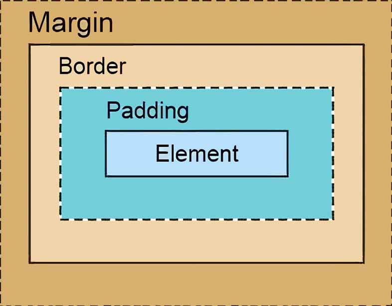
Padding refers to the space between the content of an element (such as text, images, or other elements) and its border. In simple terms, it creates an internal space within the element. Think of it as the cushioning or breathing room around the content.
Padding is expressed using CSS (Cascading Style Sheets) and can be applied to various HTML elements, including divs, paragraphs, headings, and images. You can adjust the padding in all four directions (top, right, bottom, left) individually or set them to the same value for a uniform appearance.
For example, if you have a paragraph element with a padding of 10 pixels, it means there will be a 10-pixel space between the text and the border of the paragraph. Increasing the padding will expand this space, while decreasing it will bring the content closer to the border.
Understanding Margins
Margins, on the other hand, define the space around an element, creating distance between neighboring elements. In contrast to padding, which affects the inside of an element, margins impact the outside.
Similar to padding, margins can be adjusted individually or set as a uniform value for all sides. Margins are particularly useful for controlling the spacing between different sections or elements on a web page. By adding margins to elements, you can create separation and prevent content from appearing cluttered or cramped. One of the first things to learn as a web designer is how to allow elements on the page to ‘breathe’.
As an example, if you have two div elements stacked vertically, applying a margin to the bottom of the first div will introduce a space between it and the second div. Increasing or decreasing the margin will alter the spacing accordingly.
Applying Padding and Margins
To apply padding or margins to elements on a web page, you can use CSS. Here’s a simple example:
/* Applying padding to a paragraph element */
p {
  padding: 10px;
}

/* Applying margins to div elements */
.div1 {
  margin-bottom: 20px;
}

.div2 {
  margin-top: 30px;
}
In the above code snippet, the paragraph element receives a padding of 10 pixels, creating space within the element. The first div has a margin of 20 pixels at the bottom, while the second div has a margin of 30 pixels at the top, creating space between the two divs.
This image shows margins and padding on an element based on Chrome’s web inspect tool.
Units of Measure for Padding and Margin
The web allows for a number of different units of measurement. The most common one is pixels (px) and others include percentage (%), width of the view window (vw), height of the view window (vh), and em and rem which are based on the size of the letter ‘M’. Find out why we prefer to use rem.
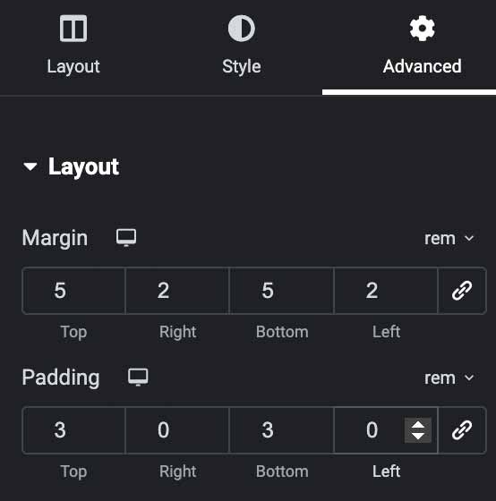
Setting padding and margins with Elementor
For our WordPress training courses we teach our students how to build sites with Elementor for its ease of use when getting started designing websites. One of the more useful parts of working with Elementor is that the three tabs in the sidebar are fairly uniform for all elements in your website. The Advanced tab is where you find the margin and padding settings for most elements.
Final Thoughts
Understanding and utilising padding and margins is crucial for achieving a visually appealing and well-structured web design. By leveraging these concepts effectively, you can enhance the readability, balance, and overall aesthetics of your website.
Remember, experimenting with different padding and margin values is key to finding the right spacing for your web page elements. So dive in, get creative, and have fun designing beautiful and user-friendly web interfaces!
Using Root EM (REM) for font-size and element margins and padding creates uniformity in your web design. Let’s dive in to find out more.
Icons are a great way to convey meaning to your site visitors with simple images. We show you how to use them with Elementor.